Rosie Production

Rosie Production is an artistic production agency dedicated to contemporary choreography and performance. The visual identity builds on the resonance of its name, exploring the rose motif as a symbol of passion, intensity, and care in the way the agency supports artists.

Logo

The logo features a custom-drawn “Rosie” wordmark, whose flowing curves evoke both movement on stage and the organic lines of a petal. A four-point star is embedded at the heart of the logotype; when decomposed into four elements and rotated by 135°, it forms an abstract rose emblem, oscillating between graphic sign and floral figure. This dual construction allows the identity to feel both expressive and precise, echoing the balance between artistic risk and production rigour.

Colors

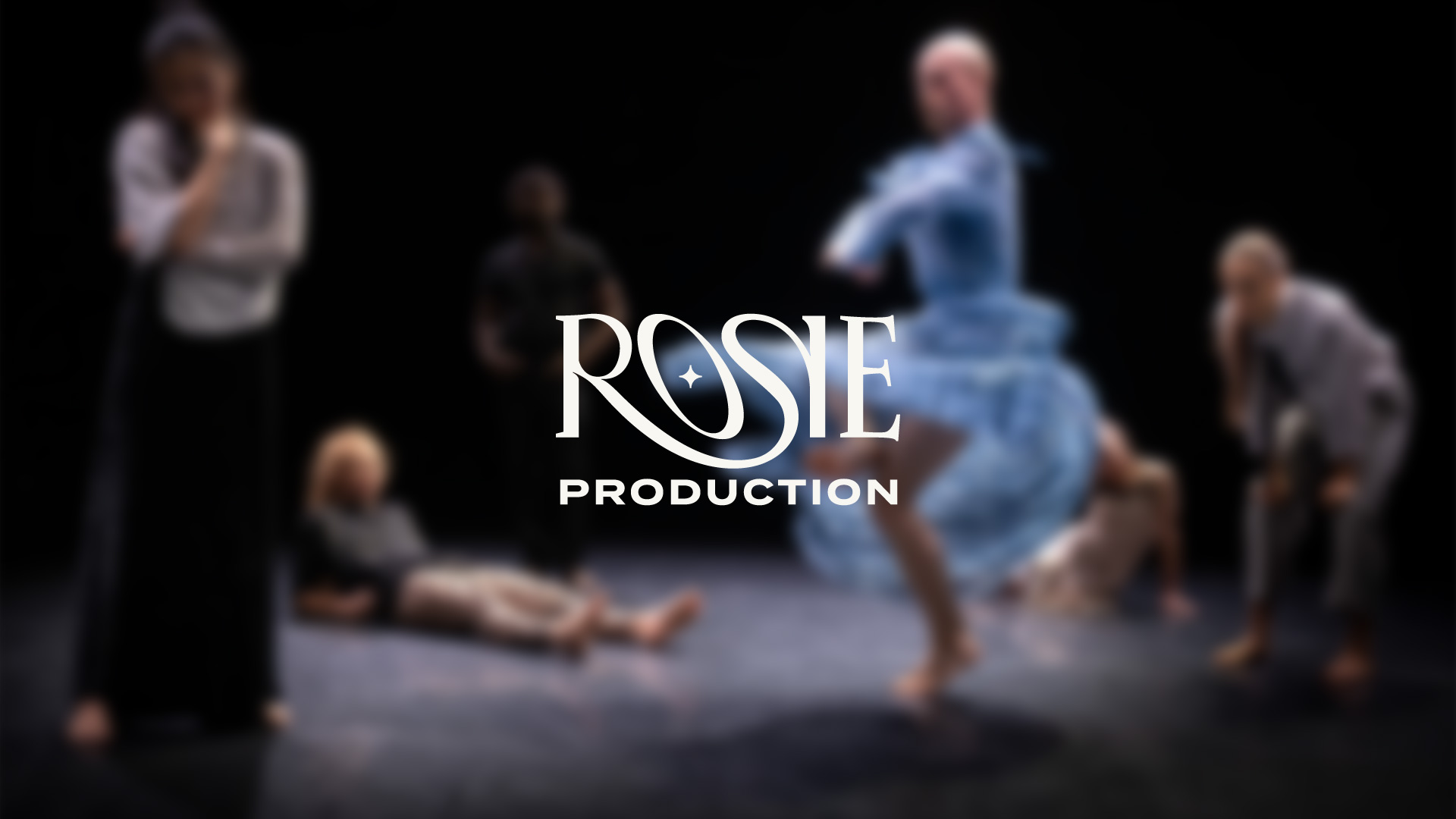
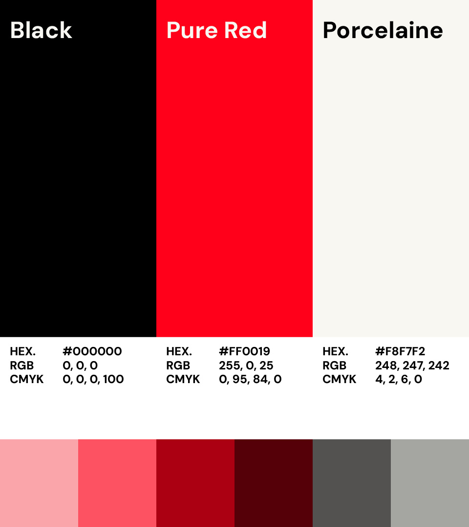
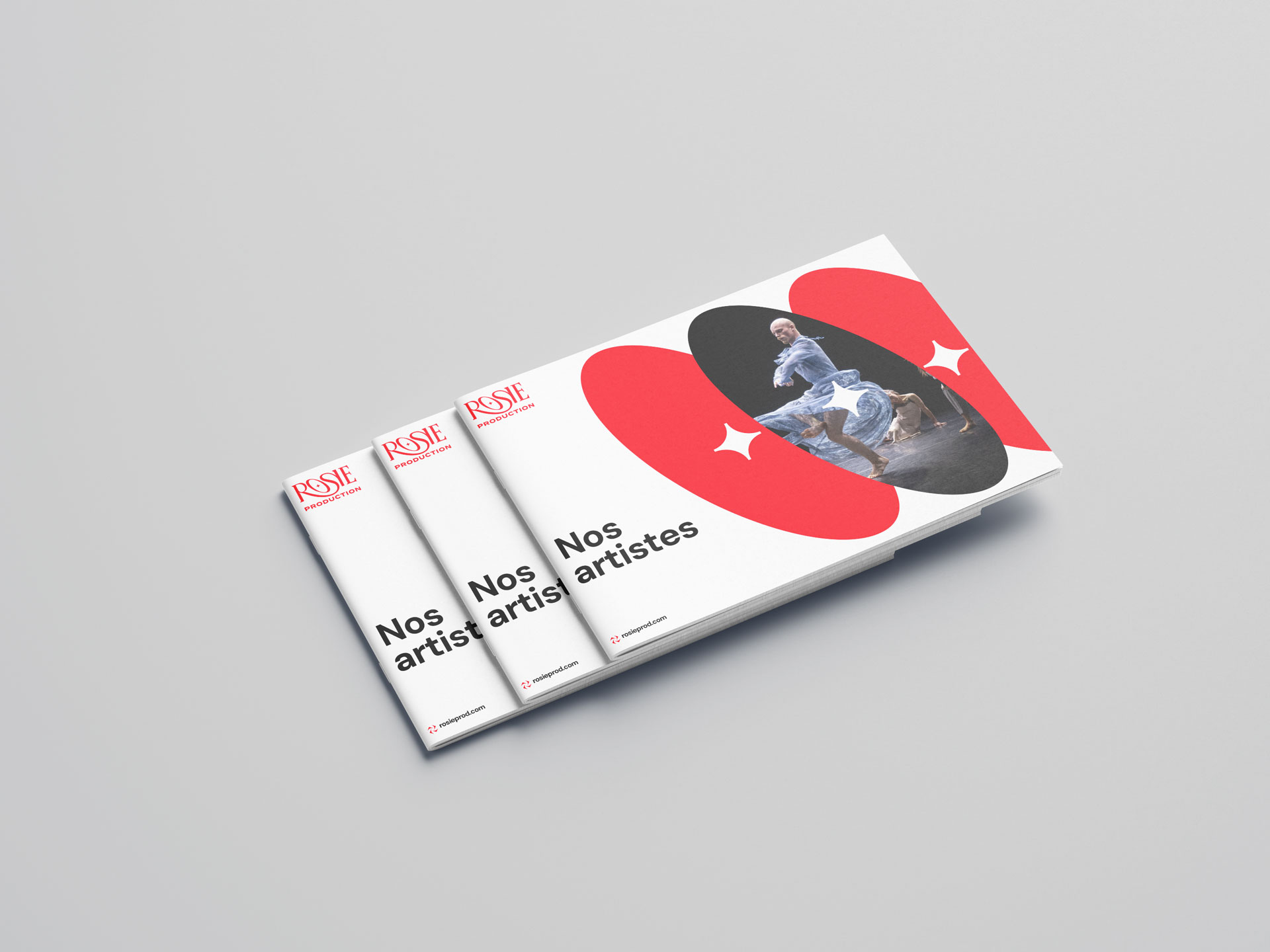
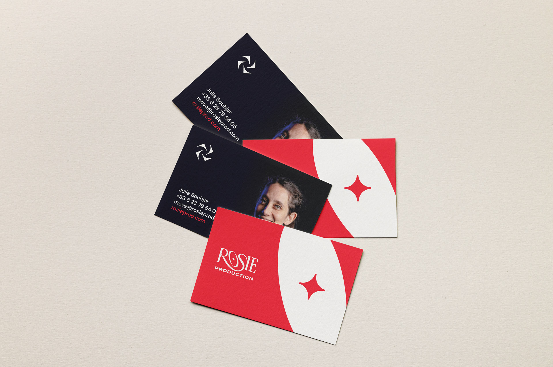
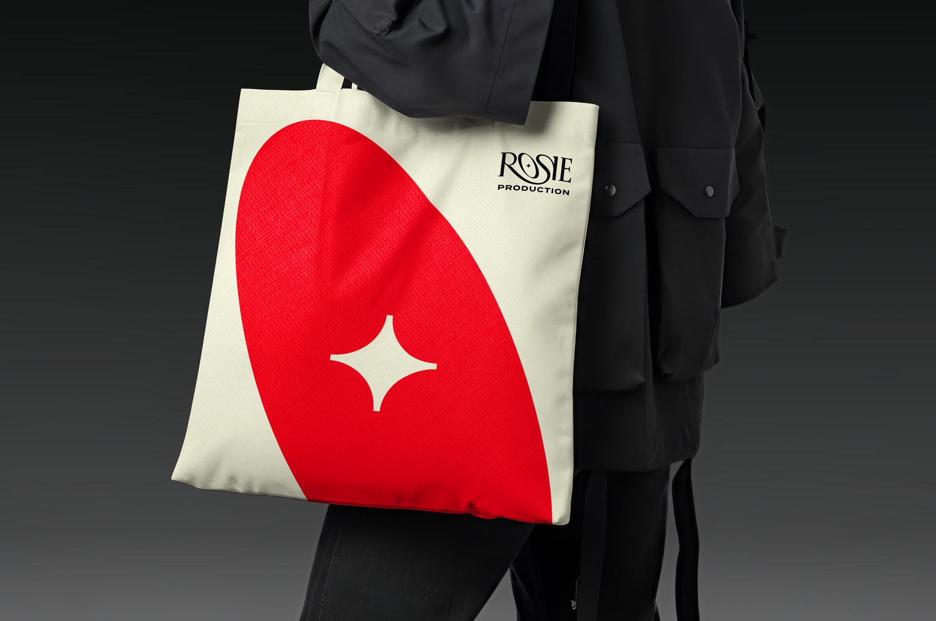
The chromatic palette combines an off-white “Porcelaine” that suggests the delicacy of bodies in motion, a deep black drawn from the darkness of the theatre, and a vivid red that carries the associations of passion, spotlight and rose. Set in DM Sans for the broader typographic system, chosen for its elegant, humanist and contemporary tone, the identity offers a flexible yet distinctive framework that can adapt to different choreographic universes while remaining clearly identifiable as Rosie Production.