EXIM PHARMA is a Belgian company specialized in parallel import of medicines. Founded by experienced professionals from the pharmaceutical and medical sectors, EXIM PHARMA enables better accessibility to medicine with lower costs while ensuring high-quality products.
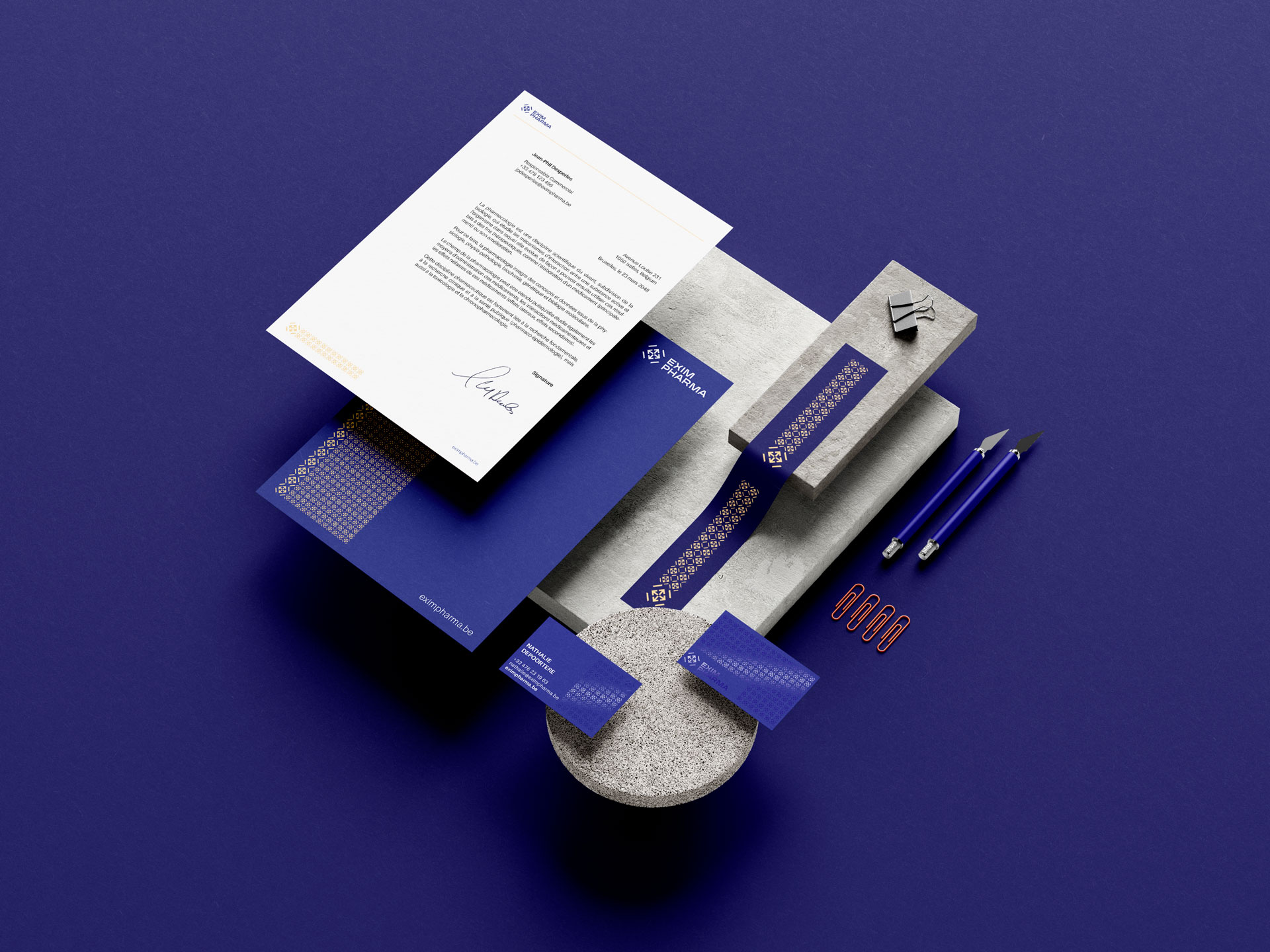
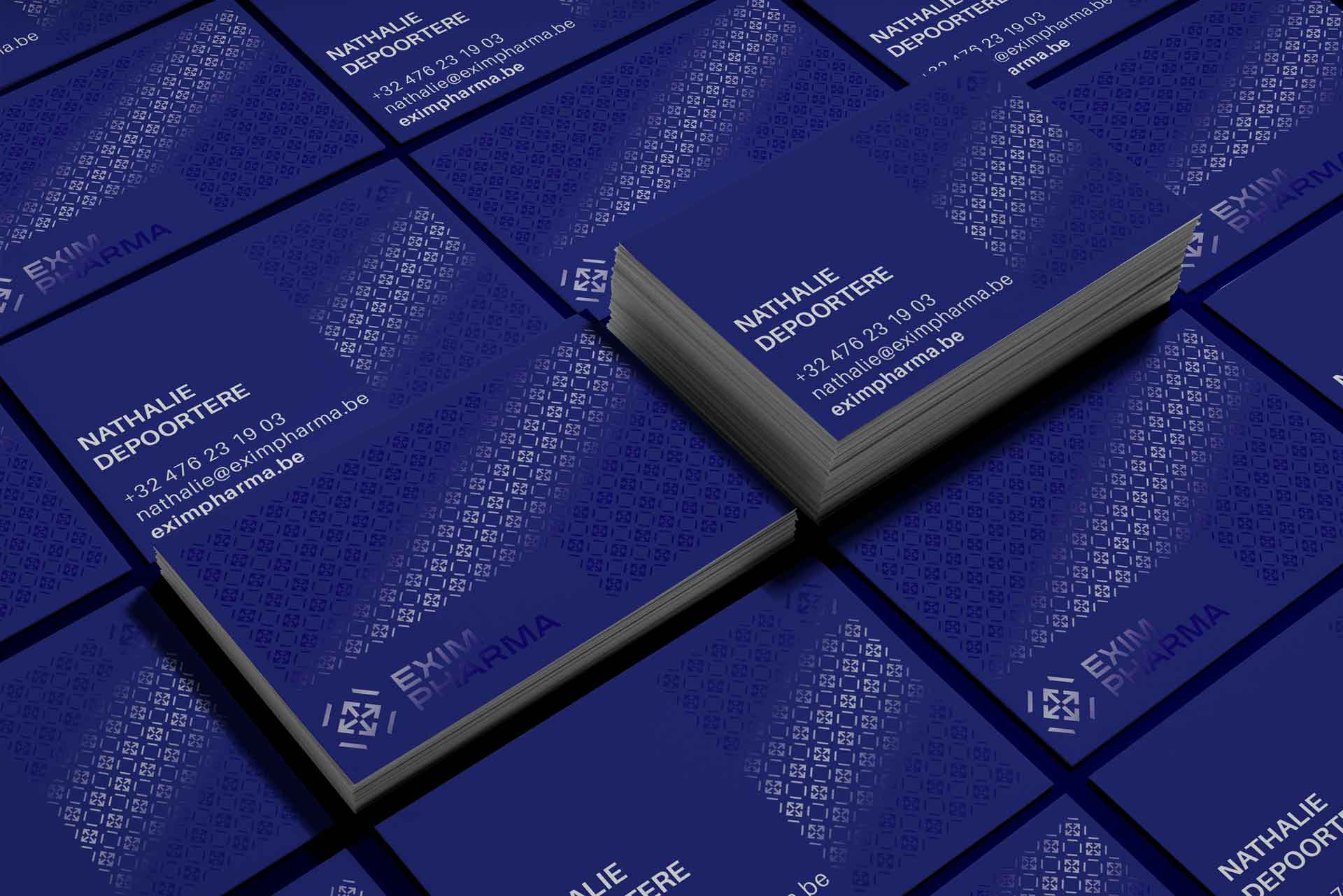
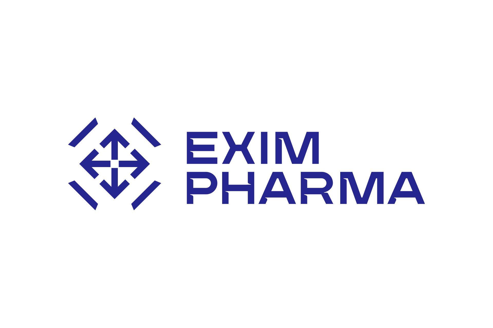
We designed for them a sleek and sophisticated identity that emphasizes minimalism and typography. The logo is minimalist and effective, constructed with an elegant pictogram combined with a unique typogram designed for the brand.
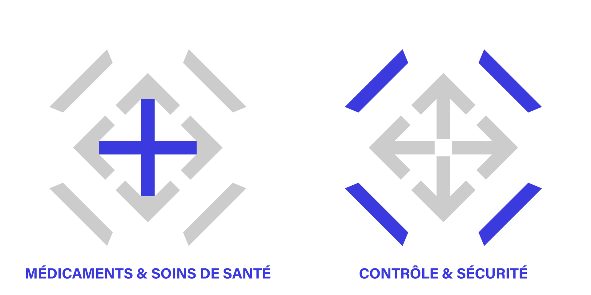
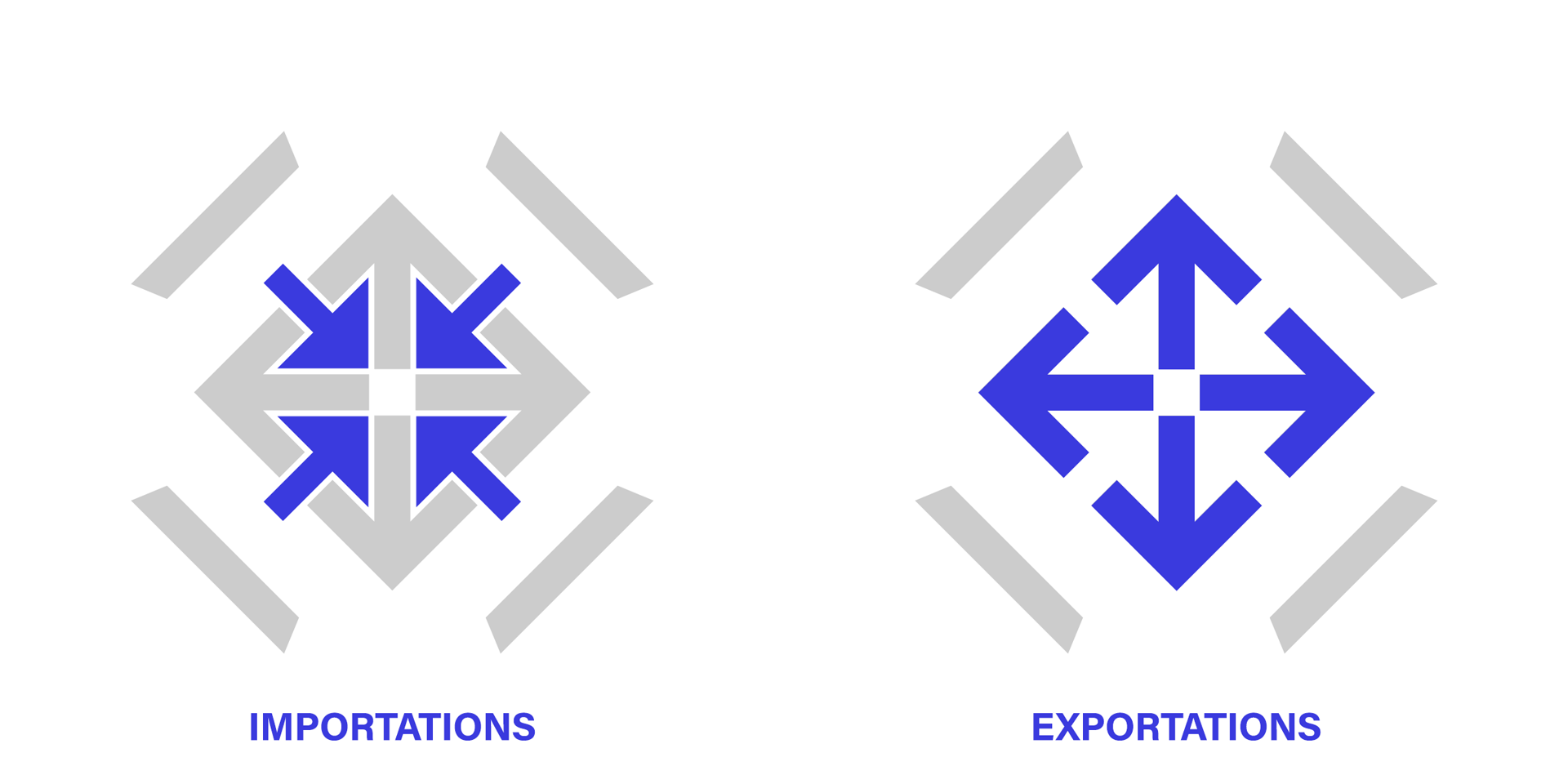
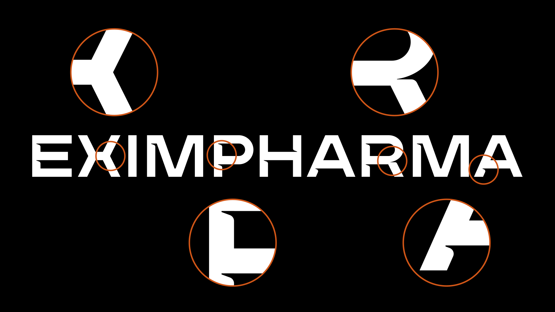
The pictogram has four levels of interpretation, each representing an essential aspect of EXIM PHARMA’s activity, namely the import, export, and quality control of medicines. We designed the typogram to achieve a unique result that resonates with the brand’s values. The final composition reveals massive, wide, and stable characters flanked by notches highlighting the dynamic aspect of the company.
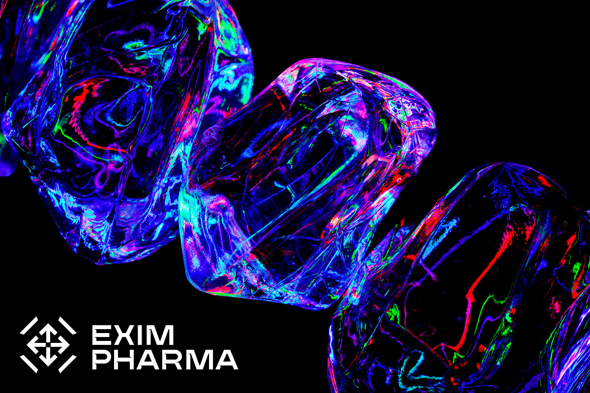
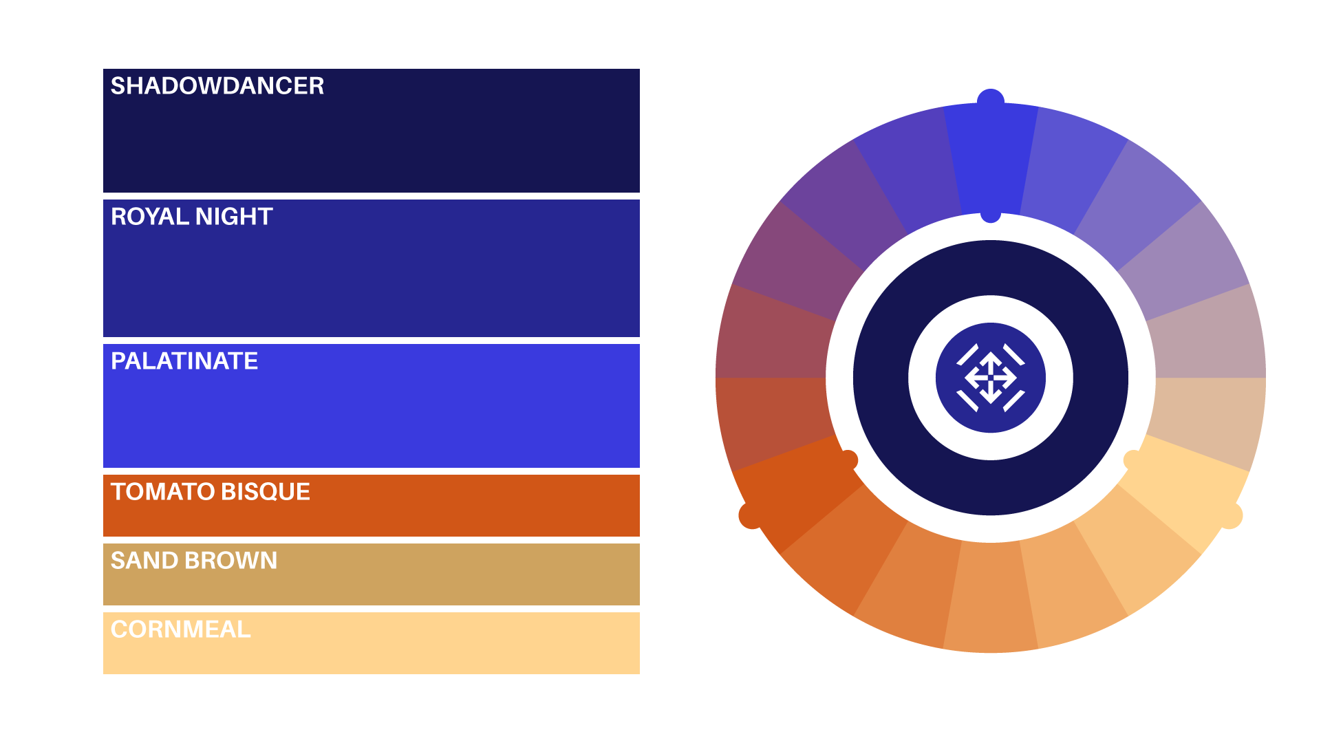
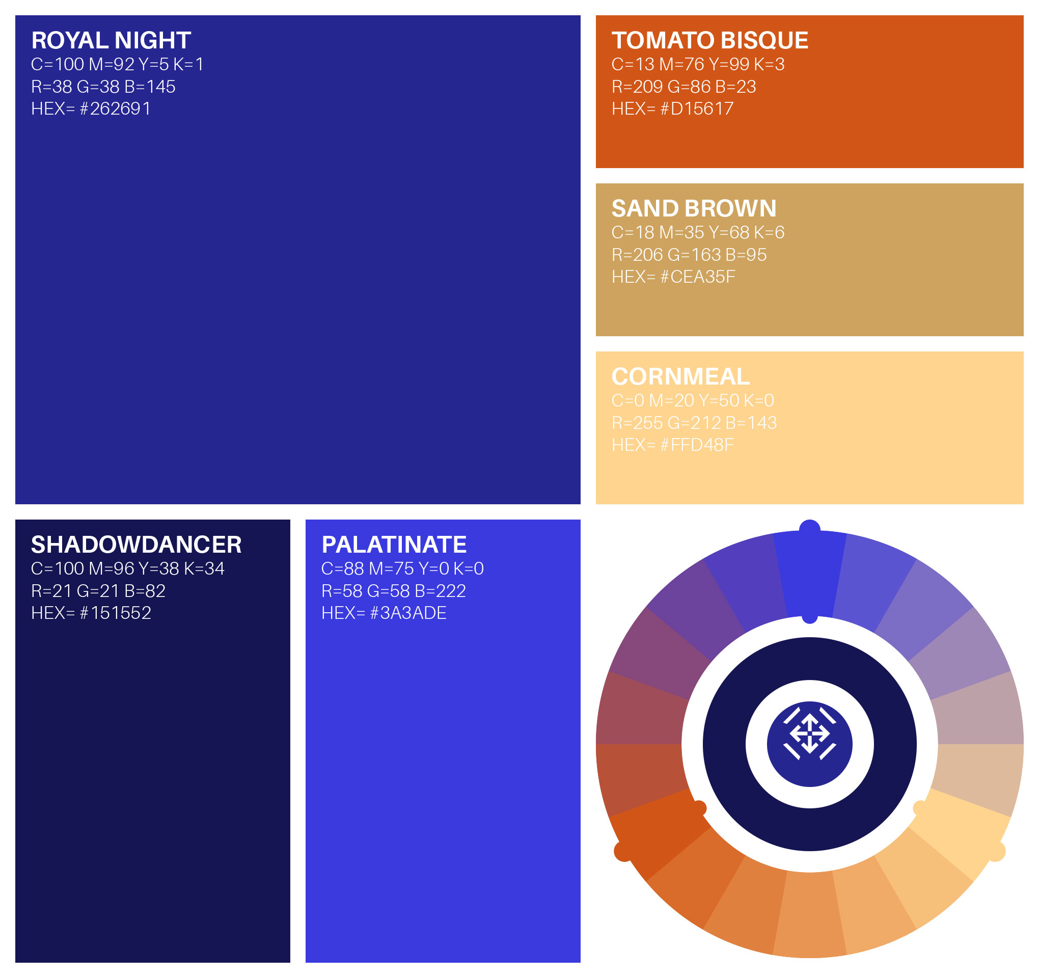
The dominant tones of the color palette are serious and reassuring, resonating with the “institutional” aspect required by the pharmaceutical sector. However, the palette is complemented by warm tones that reveal a lively and dynamic heart.
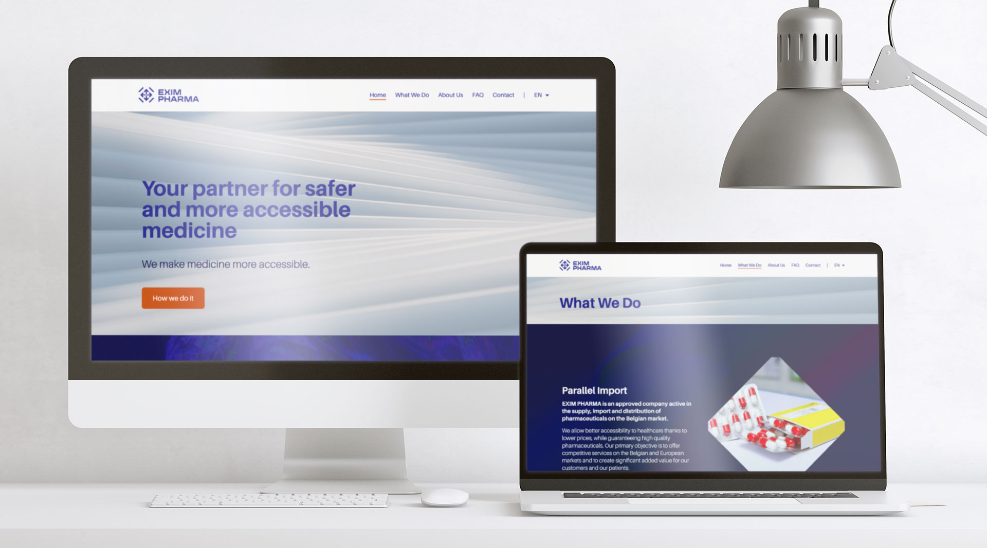
The visual identity is implemented on all classic media such as letterhead, invoice and quote templates, keynote presentations, business cards, etc. We also designed a simple, sleek, and effective website for EXIM PHARMA.