- Digital
Context & Concept
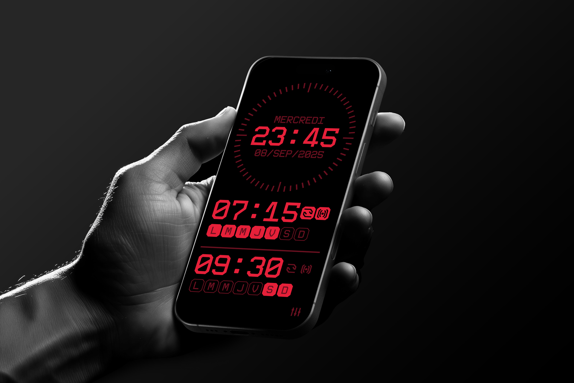
Today, many people charge their smartphones on a wireless stand on their bedside table overnight. Their phone naturally becomes their alarm clock, making dedicated alarm devices obsolete. OLED Alarm was designed as an application optimized for OLED screens, leveraging their unique properties to provide an effective and non-intrusive wake-up experience.
Concept & UX Design
The core principle of the app is to minimize light emission to preserve sleep quality. To achieve this:
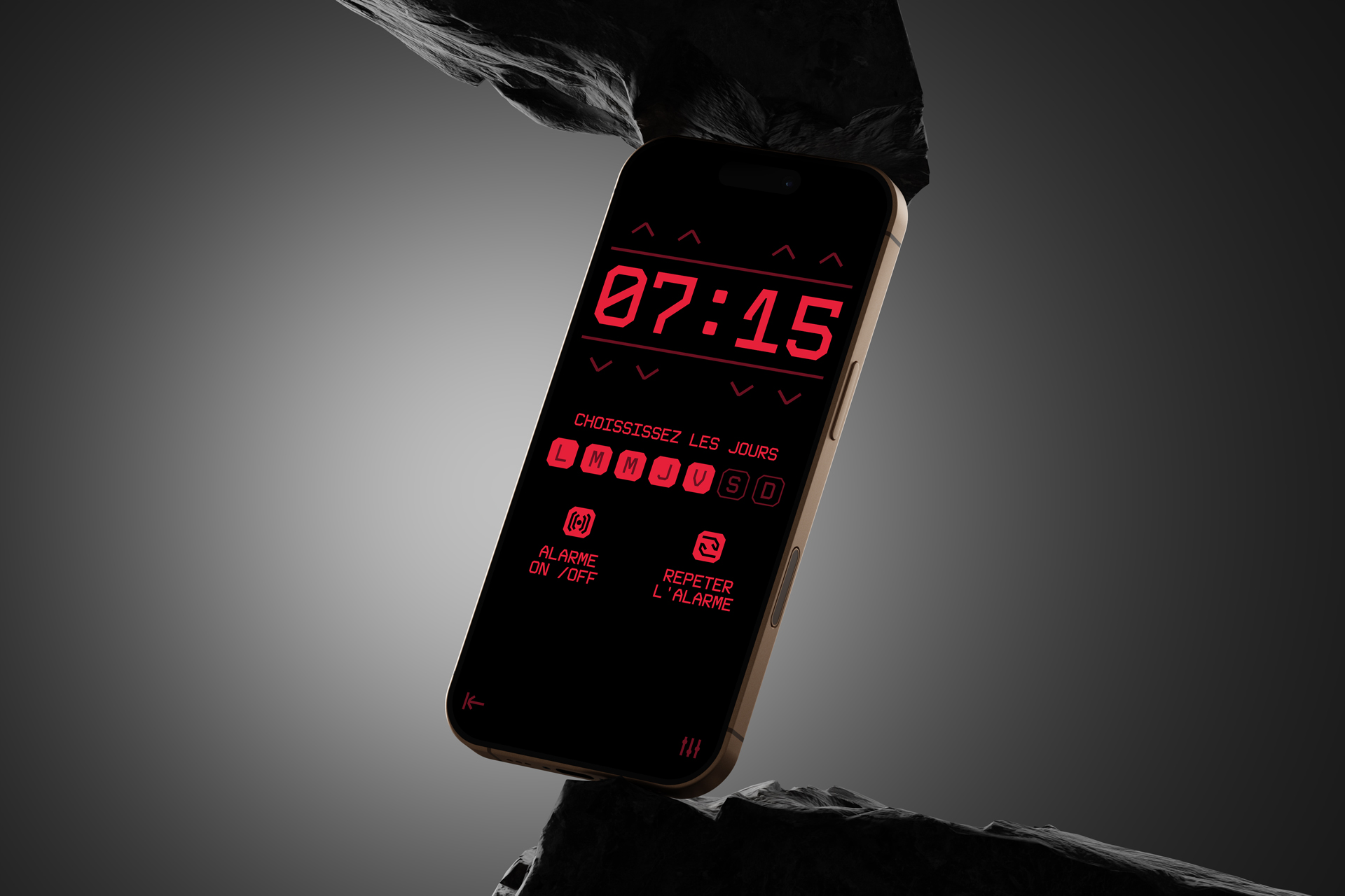
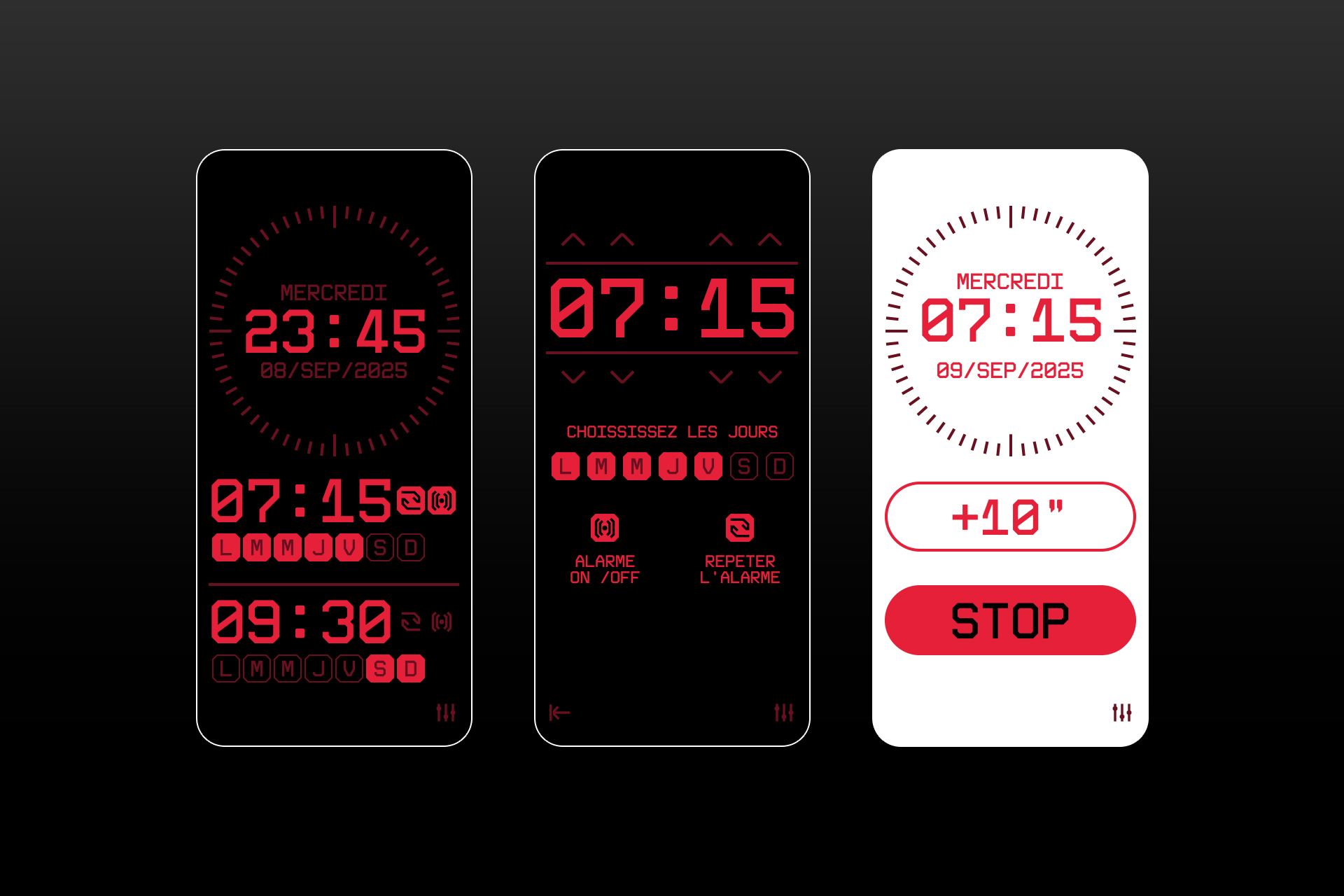
True black interface: The design takes full advantage of OLED screens’ ability to display true black, eliminating unnecessary light emission.
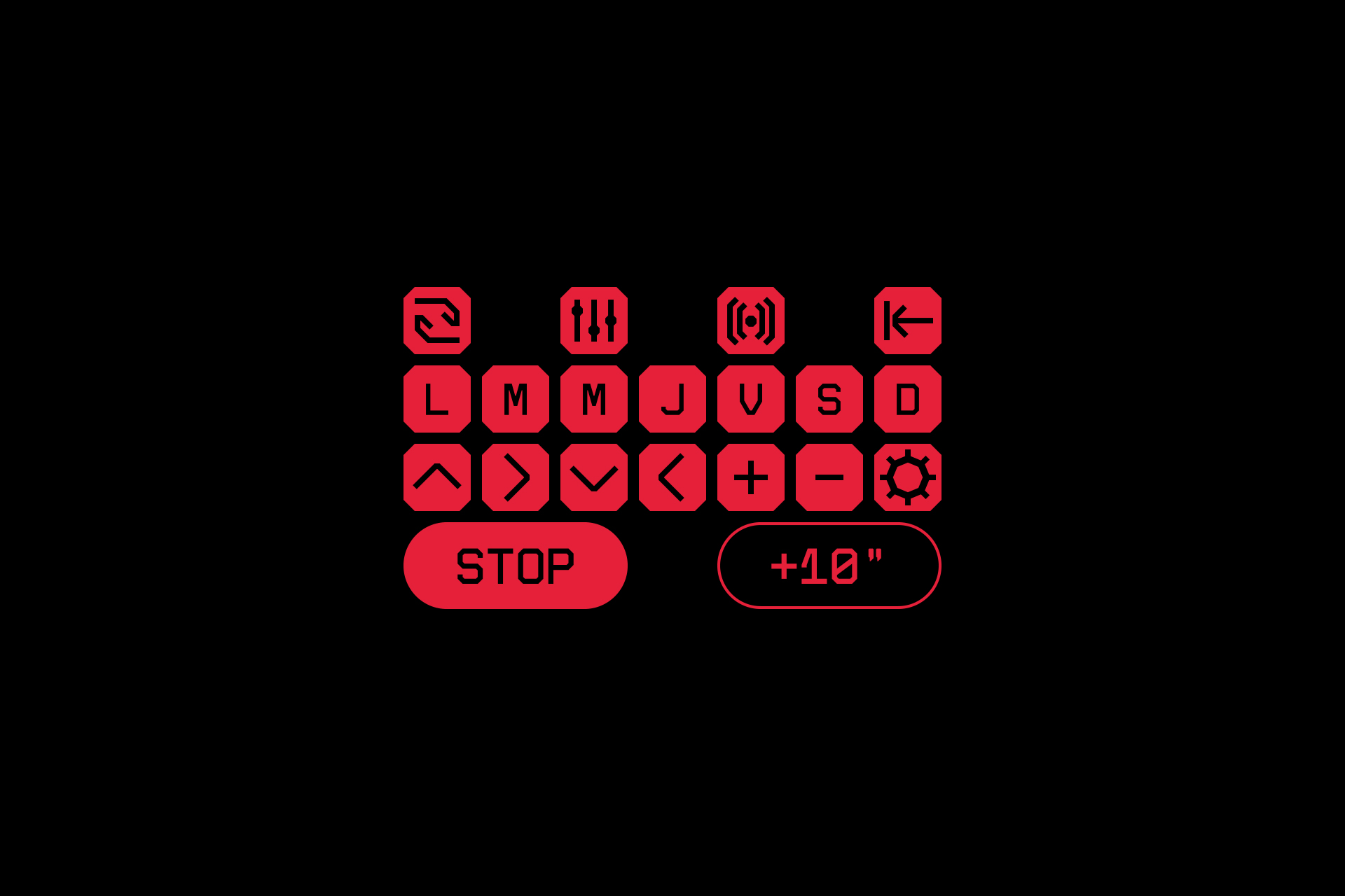
Red display for key information: Essential elements (time, alarm) are displayed in red, a color that does not emit blue light, thereby reducing disruptions to the circadian rhythm.
Visual hierarchy: Secondary information is dimmed to avoid distractions, ensuring optimal readability in the dark without being visually aggressive.
Key Features
Adaptive night display: A minimalist and sleek design that blends seamlessly into the bedroom environment.
Quick alarm setup: An intuitive interface allowing users to set multiple alarms with customizable repetition.
Optimized snooze and stop actions: Smooth and fast interactions to either extend or dismiss the alarm effortlessly.
Why This Design?
The goal was to create an application that enhances the wake-up experience while respecting the user’s physiological needs. By reducing emitted light and optimizing readability in the dark, OLED Alarm offers the perfect balance between functionality and well-being.